
ECA, formerly EasyCashASAP, needed a new brand identity that aligned more accurately with their core principles.
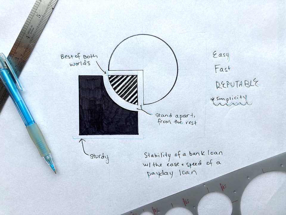
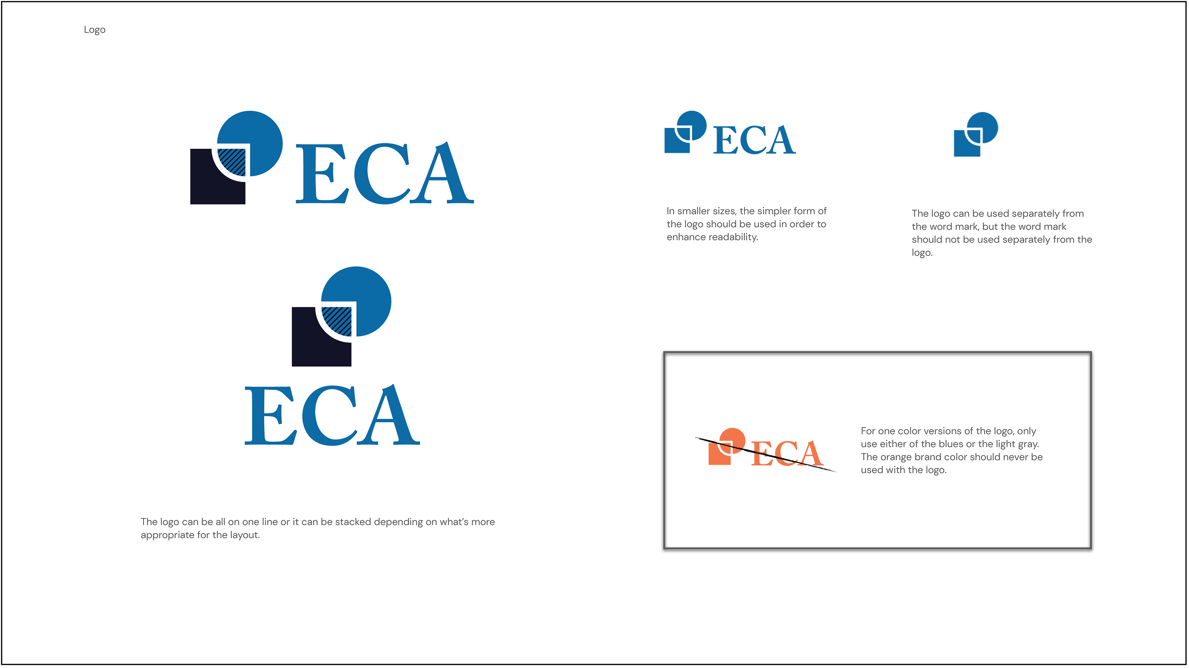
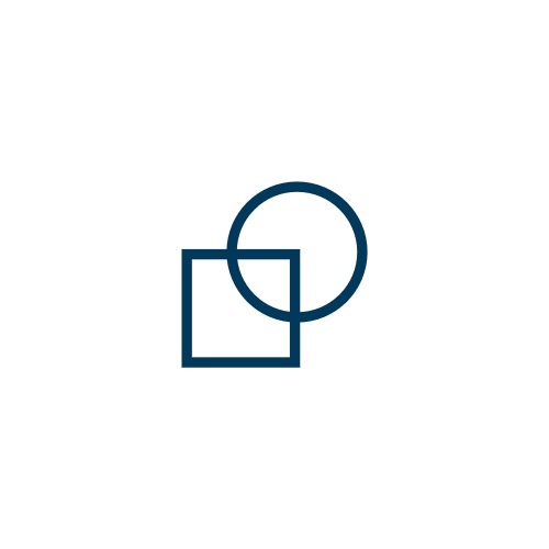
The logo is made of two overlapping shapes. The mark sits sturdy on the square shape. The overlapping portion symbolizes ECA and its role, the company combines the stability of a bank loan with the ease and speed of a payday loan. It's the best of both worlds.
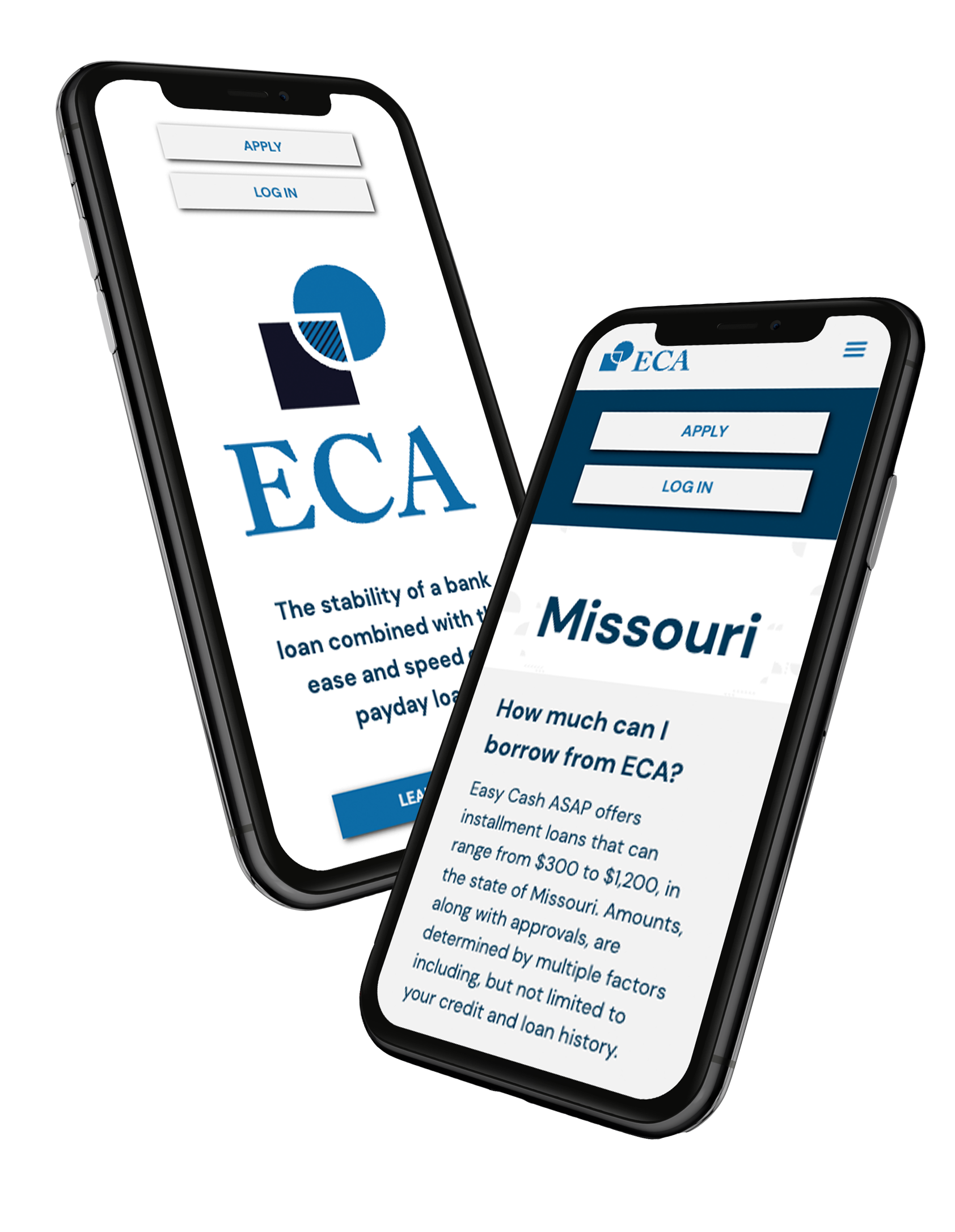
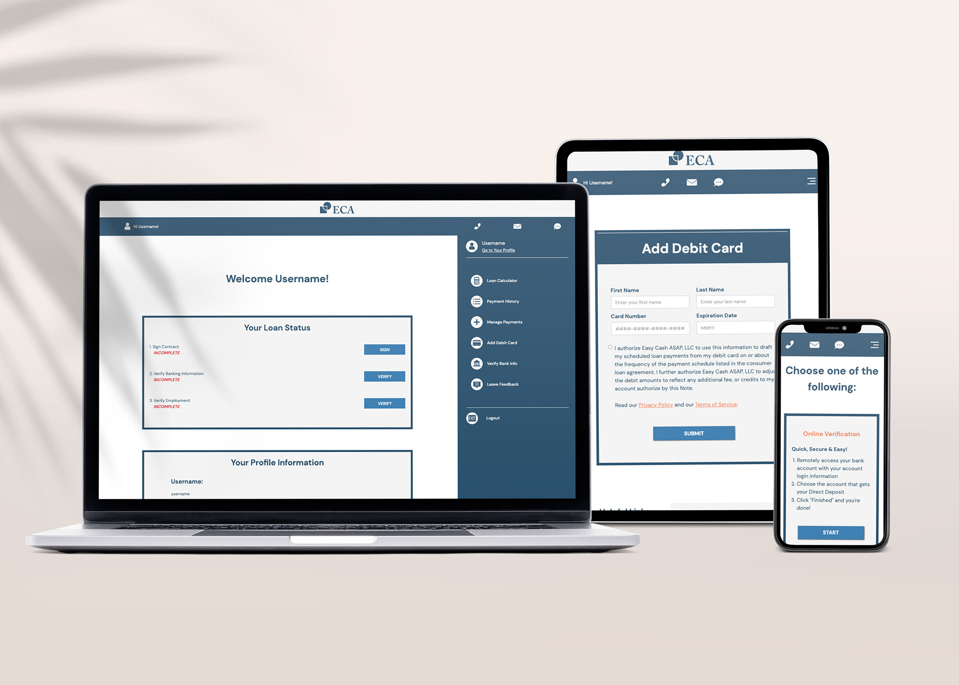
Along with a new identity, ECA needed a new website. The new site required more than just applying the new branding to the existing structure.The site was cluttered with information and confusing to navigate.

Loading animation