
For this project, audience and competition were considered throughout as brand identity was built around three established attributes. Then identity assets were developed and applied thoughtfully to a variety of touchpoints.
Follow this link to view some of my inspiration, alternative solutions and the design process for this project.
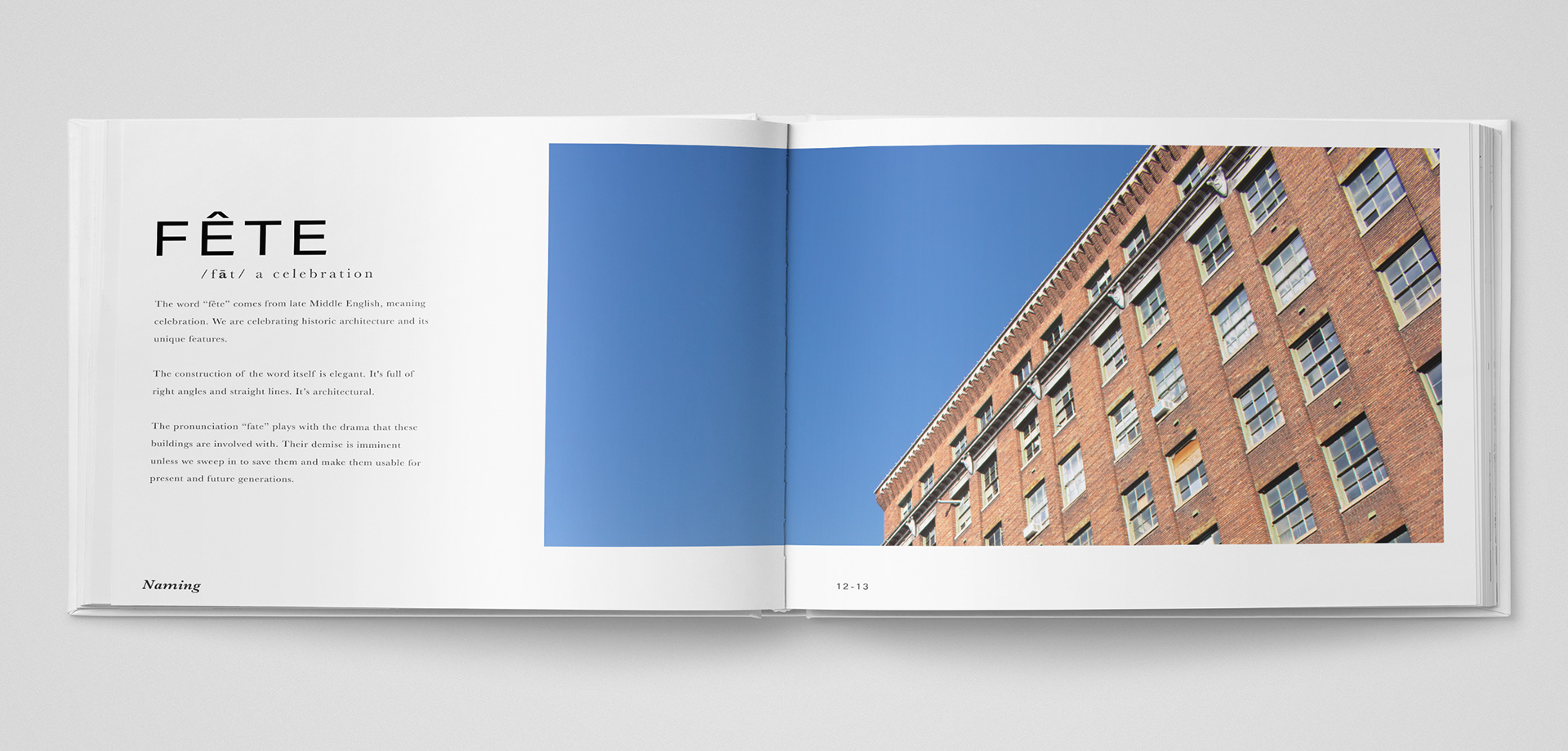
I started the naming process with the letters "Fe" because it's the symbol for iron. Iron is strong, withstanding, and the main component for buildings from this time period. But that name just wasn't strong enough. So I pushed it further and found the word "fête." The definition is "a celebration" which is appropriate because the company celebrates historic architecture. The pronunciation is also playful because the company is changing the fate of these structures.

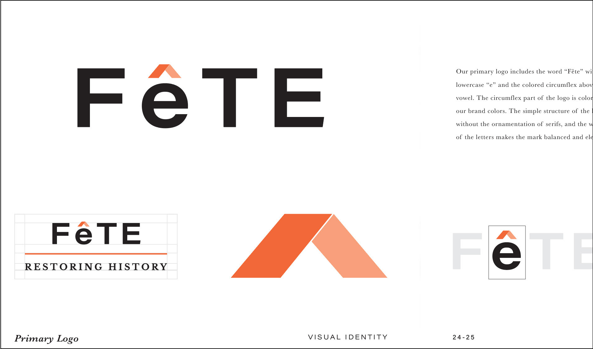
Fête uses a black and white word mark. The circumflex above the first "e" is our logo mark. The vivid orange in the logo is dynamic, the variation of tone adds dimension. The limited, yet effective use of color in the branding is elegant.
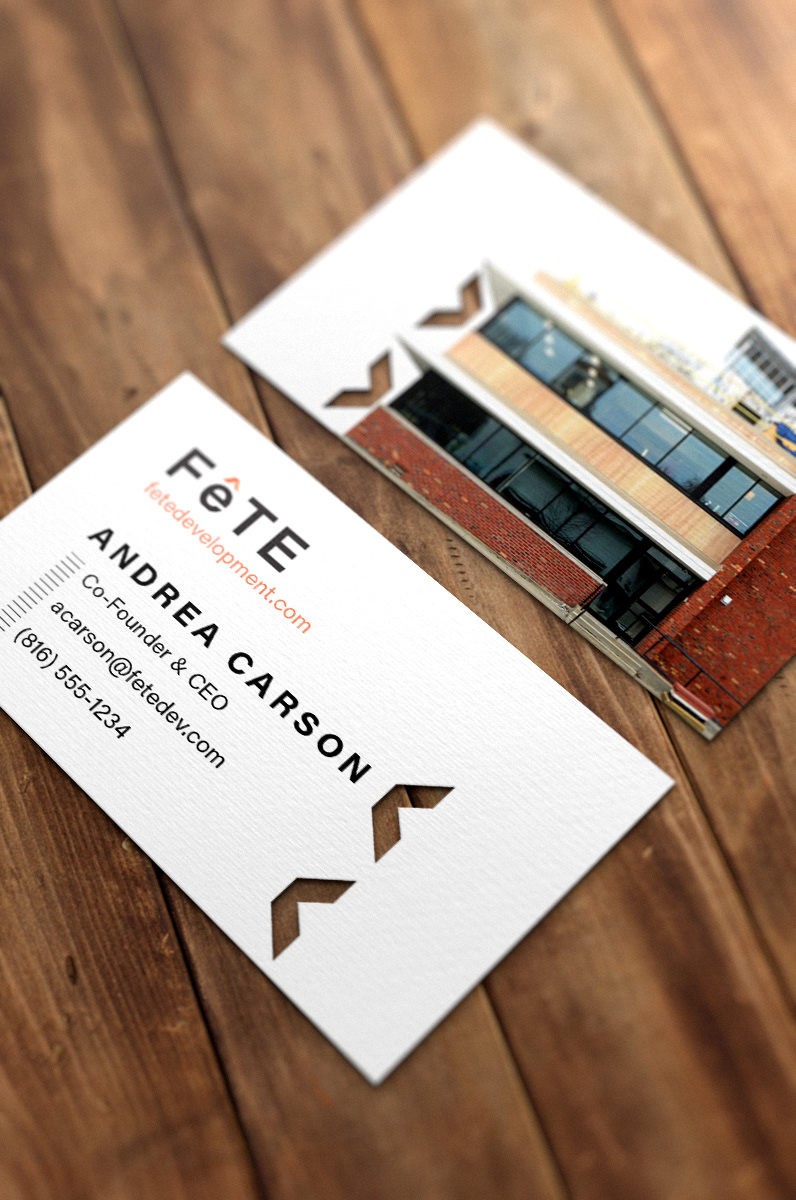
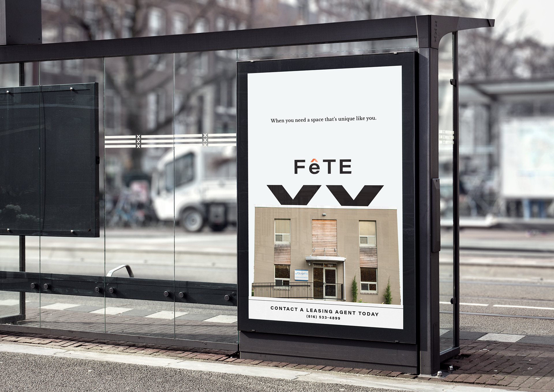

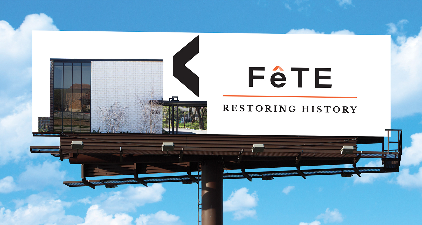
The main focus of the branding is the elegant architecture. The logo is used to strategically point the viewer's focus to the structures, but also important information on the rest of the assets. For example, the circumflex on the stationery points to where the paper would fold for a trifold.
I love how versatile the mark is! It's functional and simple at the same time.

The clean design not only showcases the real estate, it also communicates the brand’s values which is unique architecture.